Facebook’s new layout for Pages has stirred up lots of talk, rumors, emotions, over the last week…as usual, when big changes are announced on the site.
If you haven’t seen the new layout yet, view the official announcement at https://www.facebook.com/business/news/A-Streamlined-Look-for-Pages and to see a Page with the new Timleine in action, visit https://facebook.com/marketing/timeline
I’ve signed up for the early-rollout waiting list, and I’ll be writing more about it once I have it.
For now, here are a few things to take note of as we all prepare for updated Pages:
1. A Single-Column Layout for Page Posts (the familiar look of a Personal Profile)
Just like your Personal Profile, there are 2 columns visible: the left column contains information about your Page, while the right column displays your posts.
This new design should make it easier for users to navigate, as they are more comfortable with the single column of posts on Personal Profiles.
Having said that, I can tell you that I don’t scroll down much on anyone’s Personal Profile; and I doubt users will scroll down very far on a Page’s single column of posts.
Tips:
Use the “pin a post” feature to spotlight important posts at the top of your right column (as far as I can tell, this feature is still operational on the new layout).
Use images and/or video in your most important posts to catch users’ attention if they are scrolling down your right column.
2. Custom Apps and Tabs are not Showcased (big layout changes)
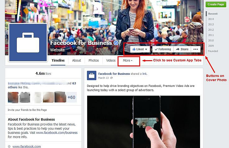
Custom Apps are still operational with the new layout, but the Tab icons that appeared just under your Cover Photo are no longer there. Users will now have to click on the “More” button under the Cover Photo to see Tab icons.
See my screenshot #1 below:
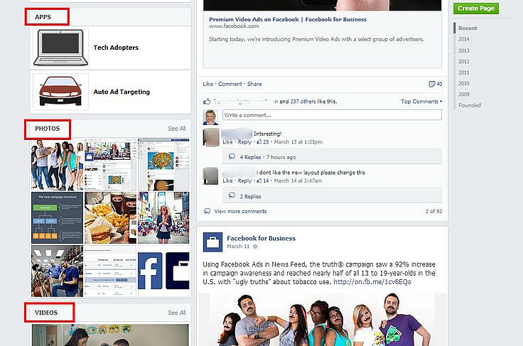
Your Custom Apps (and Tab icons) are displayed in an area in the left column. It looks like users will have to scroll down a bit to see this section (which may be a concern).
Tip:
Use proven strategies to drive traffic to your Custom Apps (the same strategies we recommend with the current layout):
Create posts with a call-to-action and the link to your App, like Click here now – Enter contest now – Get your free report now.
Since over 60% of users access Facebook on their phones, and Custom App Tabs aren’t displayed on mobile devices, use a third-party app to create Custom Apps with a “smart” mobile URL.
Use the Promote a Post feature and/or Facebook Ads : yes, you’ll have to invest some money into this strategy, but the reality is that for most small business owners, a Facebook Ads budget is part of a successful marketing strategy on the site.
3. Photos and Videos are Showcased More (in the Left Column)
There are large areas (boxes) on the left column where a Page’s photos and videos are displayed. This is similar to the way your photos, Pinterest Pins, videos are displayed on a Personal Profile.
See my screenshot #2 below:
So if a user does visit your Page’s Timeline, your photos and videos have a better chance of attracting attention with the new layout. With the trends in visual content, this layout change makes sense.
Tip:
If you haven’t already, get serious about a visual content strategy.
Photos and videos that: showcase your products/services, show the “human” side of your business, and speak to the lifestyle of your target audience – these are all examples of things to share on your Page.
Since Facebook owns Instagram, and Instagram integrates so easily with a Page’s Timeline, you may want to consider branching out to this site if you haven’t already.
4. Cover Photo Adjustments
You may need to make some adjustments to your Cover Photo if you have text/graphics in the lower right side of the image, as the new layout places buttons in that area. (My screenshot #1 above, shows how these buttons appear on your Cover.)
The current Cover Photo size of 851 x 315 pixels seems to remain the same.
I recommend waiting until you have the new layout to check out how your Cover Photo looks; then make adjustments if necessary.
Please note: These are just a few initial comments and tips I have about the new layout, but I don’t have it yet. As I learn more, and start working with the new layout on my/my clients’ Pages, I’ll update this post and add more tips in a series of posts. So check back for updates!


