Each social site has different recommendations on how to create content that optimizes their built-in features. To get the most out of a social platform when sharing or uploading content, it’s important to stay up-to-date on those guidelines. I’ll be sharing a series of posts on the current posting guidelines for the major social platforms, starting with Facebook. Here are 2 tips for uploading your blog posts and images for maximum visual appeal.
Link Post Images
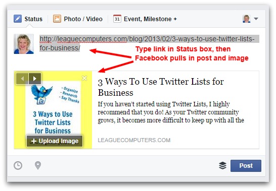
As of August 25, 2014 Facebook announced they were placing more value on link posts and less on photos with the link included. A link post is simply when you put a blog/website’s link into the status box, and then Facebook pulls in an attached image, as well as a short description of the blog post (see screenshot below).
So you may want to include more link posts in your content calendar if you’re not already. (Note: every Page is different, so you may find that photos with a link get better engagement than link posts. Test it out on your Page.)
But to take advantage of the increased exposure of link posts, make sure the blog post image attached to the link is properly sized for the Facebook news feed.
Facebook recommends a size of 1200 x 627 pixels for link post images.
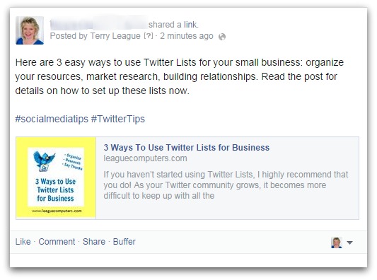
If you upload a post (either yours’ or another blog’s), with a different sized image, it will not stand out on users’ news feeds. Notice that in the screenshot above, the image attached to my “3 Ways to Use Twitter Lists for Business” post is not the right size, and is showing up as a smaller thumbnail.
The screenshot below is how my original post will appear in users’ news feeds – it’s not optimizing the space Facebook allots for images, and does not stand out.
But you can upload another image separately before you publish the original post. Notice the Upload Image button on the first screenshot above. The recommended size for image link uploads is 560 x 292 pixels.
You can create a new image to accompany the link using a few free tools like PicMonkey and Morguefile.com.
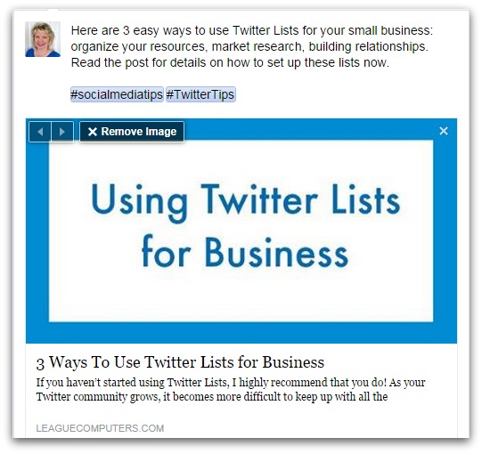
You could make a text-only graphic in a photo editor like PicMonkey or Canva using the topic of the post (see example below):
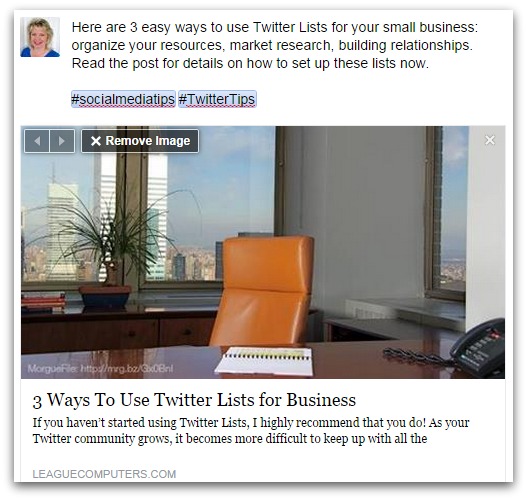
Or use a site like MorgueFile.com to grab an image that fits the theme of the post or the theme of your page. MorgueFile photos do not require attribution but I recommend placing a bit of text like “image courtesy of MorgueFile.com” with the link somewhere on the image anyway.
Here is an example of one I found on MorgueFile, cropped using PicMonkey, and then uploaded to the link post on Facebook:
The link post will now have a greater chance of catching users’ attention with an image/photo that optimizes the space available on the news feed.
Photos & Graphics
Even with Facebook’s recommendation for using link posts, you may find that your Fans engage more with photos. As I mentioned above, every Page is different, and you may want to test a variety of content (link posts vs photos) to see which ones have better success on your Page.
The current optimal photo size for a Facebook post is 940 x 788 pixels. So it makes sense to crop your photo to the optimal size – PicMonkey can also help with this task.
Or check out Canva: they have created a Facebook Post template with those exact dimensions. Note that with Canva, you can upload your own photos for free or use their stock photos in your designs for $1.00 each.
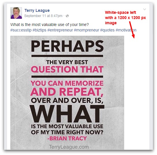
The previous recommended size for photos in posts on Facebook was a square 1200 x 1200 pixels, and those dimensions still work. You’ll notice some white space around the photo in the news feed (on desktop), but as long as the image itself is in focus, it will look okay. See the white space in the example below (a quote image from my personal blog Page):
Another thing to keep in mind: if you are planning on using the same photo on sites like Pinterest or Instagram, where a “square” orientation shows up best, then stick with 1200 x 1200 pixels on Facebook to avoid making another version of your photo.
Use these 2 tips for optimizing the space available on Facebook posts to make your updates more visually appealing.
As guidelines and recommended image sizes change on all sites, we do our best to keep you updated. To make sure you don’t miss the latest social media news, updates, and announcements, subscribe to our weekly Social Media Solutions. It’s delivered to your email inbox once a week, with exclusive content for subscribers. Get your copy HERE.
Top photo credit (derived from): kenteegardin via photopin cc

