Have you noticed the new Pinterest layout launched this week for desktop? There are a few big changes to the navigation of your account, and you can see them in the screenshots and points I share below.
#1: Your Home Page is Less “Busy”
Going from left to right on the screenshot below:
Click on the small Pinterest “P” icon to get back to your home page or to refresh it
The Search bar is much bigger! Which makes sense when you think of how Pinterest has become a serious competitor to Google as a search engine.
The drop-down menu for Categories and links to Pinterest’s blog, privacy terms, etc. is now positioned on the right side of the Search bar.
Your account name/icon – click on this tab to go to your public profile. (Note this used to contain a drop-down menu that has now been moved to a new tab on your profile – see the “gear” icon in the next screenshot below). The Notifications button stays in the same place next to your account name/icon.
#2 Your Public Profile Has a New Drop-Down Menu
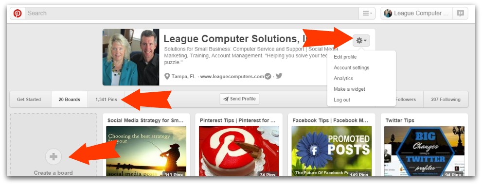
Once you’ve clicked on your account name/icon tab, you are taken to your public profile (see the screenshot below). This is what other Pinterest users see when they go to your account.
Notice that the “gear” icon is a drop-down menu where you can edit your profile and account settings, view your analytics, make a widget or log out.
The navigation menu for your Boards, Pins, Followers/Following remains the same. Note that if you click on your Boards (or Pins) tab here, you can use the “Create a Board”/”Create a Pin” option to upload new content.
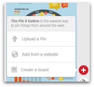
I’m pointing that out because you’ll notice that the options to “Upload a Pin, Add from a website, Create a board” have been moved all the way to the bottom right side of your screen (see Tip #3 below).
#3: The Upload a Pin Button Has Moved
In the screenshot below you see the pop-up box that appears when you click on the “+” button in the bottom right of your screen. It may seem a little inconvenient at first to have to go to the bottom of the screen for this, but I guess Pinterest wanted to keep your home page navigation less cluttered.
There is also a “Help” button below the Add button if you want to get to Pinterest’s help section.
#4: Notifications Have a “News” Section
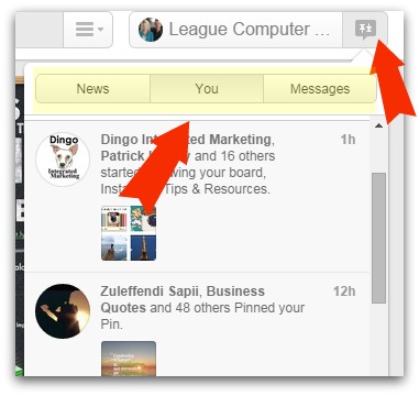
A recent change on the Notifications tab was the addition of a “News” option. This tab shows you recent activity of the accounts you are following. You may find this helpful to keep up with industry influencers or prospective clients.
See all of your notifications (when users follow your boards, pin your Pins, etc) on the You tab, and send/review private messages on the Messages tab.
Do you like the new layout? I think it makes a less cluttered home page, with much more emphasis on Search (especially now that Guided Search is available).
Have any questions? Or are you looking for some training or strategy on how to best use Pinterest for your business? I can help with both! Contact me at terry@leaguecomputers.com and we can discuss your Pinterest needs.


